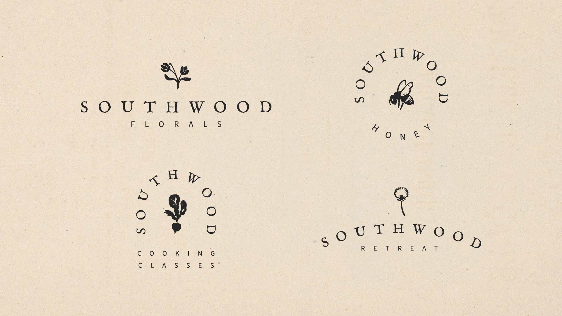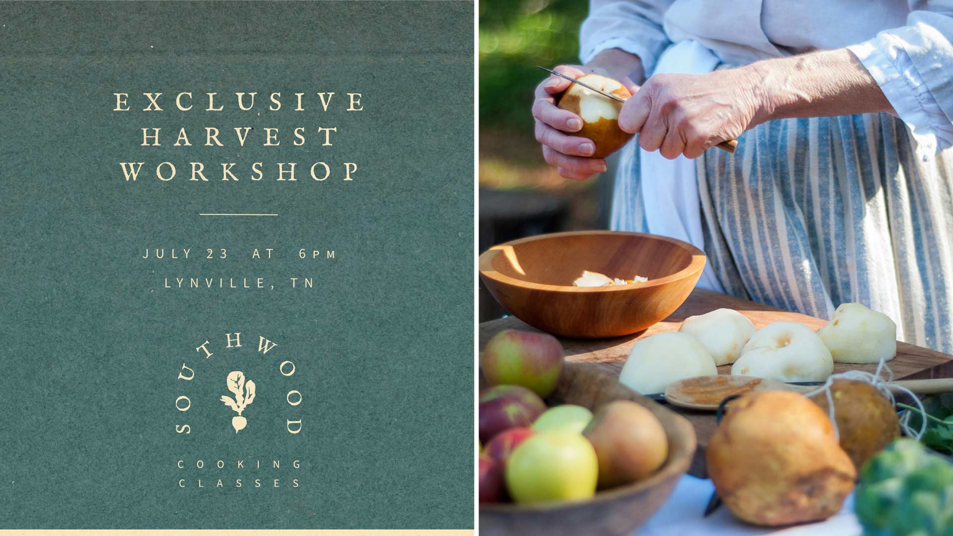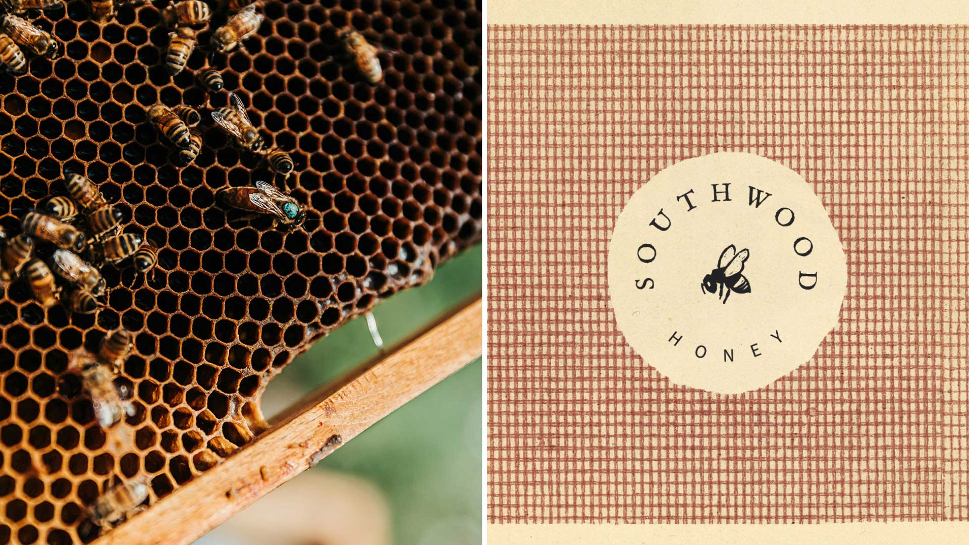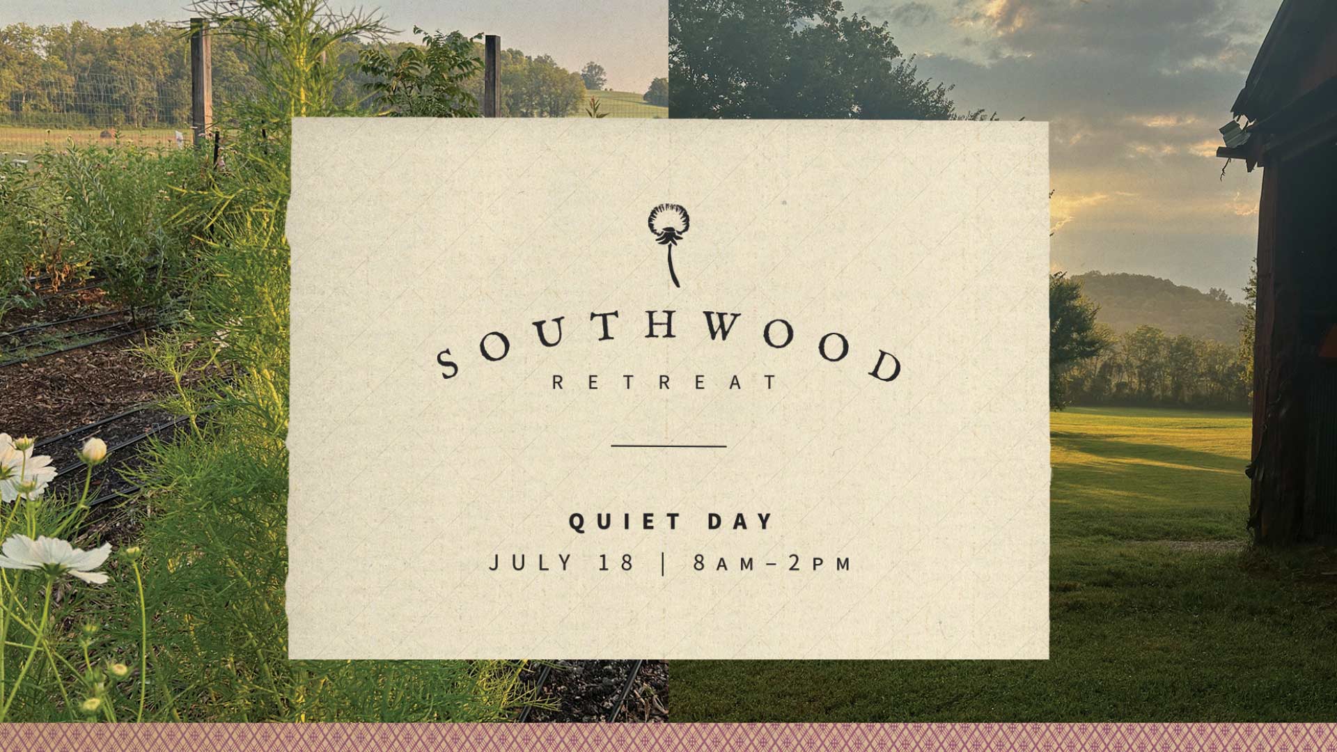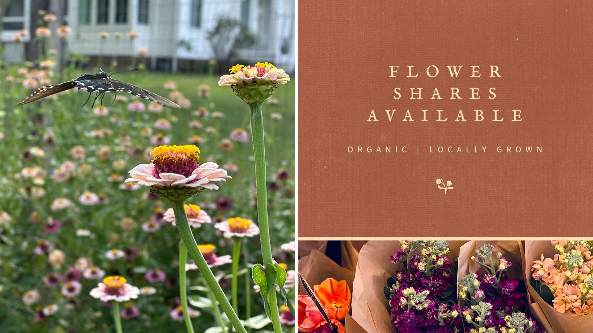
Southwood Farm is a flower farm and unique space to retreat to solace, beauty, and joy. The brand draws inspiration from the quiet beauty of a first-edition book using aged paper, cloth-bound covers and classic typography. The goal was to create something with a sense of rest that feels timeless and reflects the character of the farm itself.
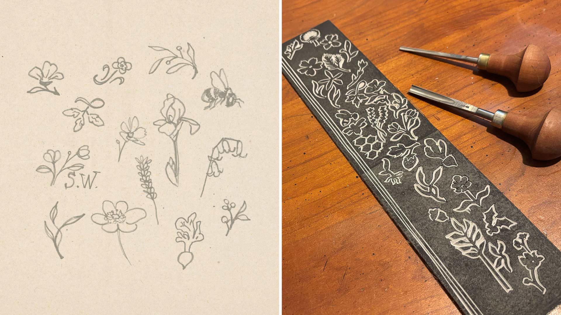
The logo marks were designed to resemble the small printer’s ornaments often found on historic book title pages. Each was hand-carved and relief printed, similar to the traditional process of early bookmaking and giving the brand a tactile quality.
The primary typeface, IM Fell, carries that influence through as well. Its letterforms are based on historic typefaces collected by Bishop John Fell for the founding of the Oxford University Press, creating another connection to the world of classic book publishing.
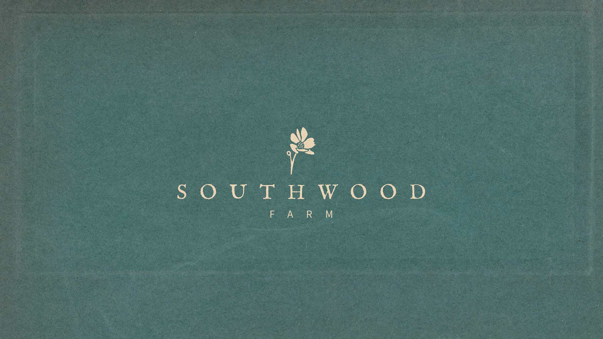

The identity was designed as a flexible family of brands for the different parts of life at Southwood Farm. Florals, retreats, beekeeping, cooking classes and other future offerings each have room for their own personality while still feeling connected to the larger Southwood Farm brand.